

Description
Responsive Menu is a free mobile menu and hamburger menu plugin for WordPress. More than 70,000 sites use it, and it’s rated 4.5★ from 570+ reviews. Pick any WordPress menu and Responsive Menu turns it into a hamburger button and a slide-in mobile menu. It works with any theme, keyboard and screen-reader users can use it, and you set it up from one screen without writing CSS.
See it in action: responsive.menu · Live demo
Why choose Responsive Menu
- Works with any theme or page builder. Classic themes, block themes, Elementor, Divi and others all work. Responsive Menu adds its own mobile menu and hides your theme’s menu, so you don’t need to rebuild your header.
- Accessible out of the box. The menu button is a real
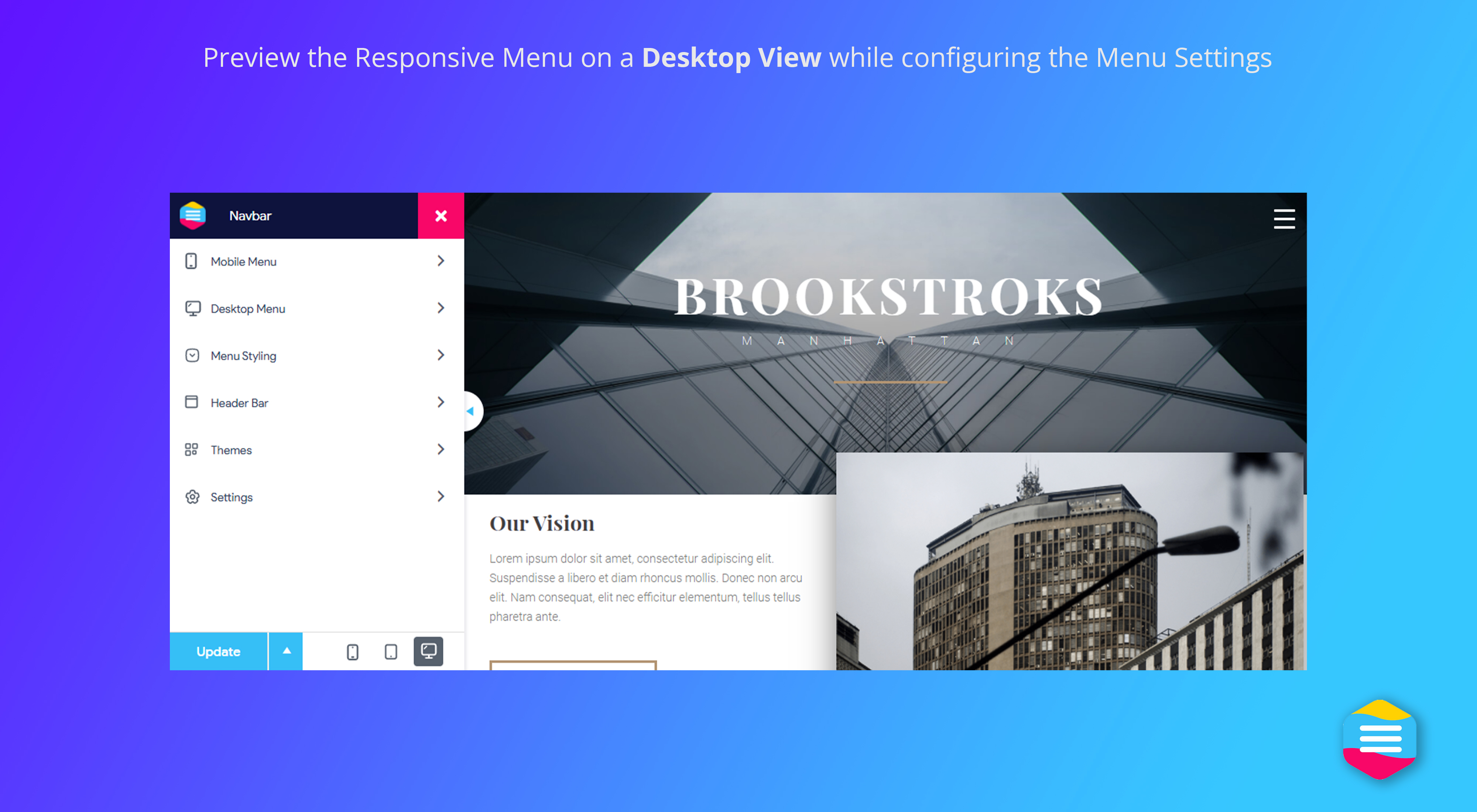
<button>witharia-expanded. Submenu toggles are labelled, focus stays inside the open menu, Escape closes it, focus outlines are visible, and reduced motion is respected. We test it with axe-core against WCAG 2.0–2.2 A/AA rules (see the results). - 150+ options, no code. Set colours, fonts, animations, position, breakpoints and sub-menu depth in a live editor with phone, tablet and desktop previews.
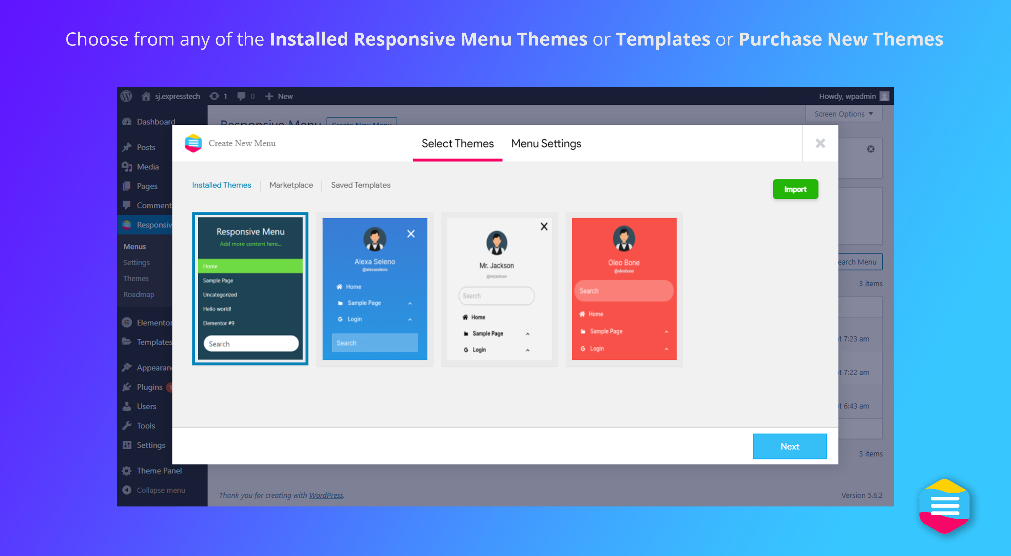
- Pre-built menu themes. Start from a ready-made design and adjust it.
- One menu to maintain. Responsive Menu reads from your existing WordPress menu, so when you edit the menu, the mobile version updates too.
- Show items to the right people. Hide menu items from logged-in or logged-out visitors, or show them only to selected user roles.
Popular ways to use Responsive Menu
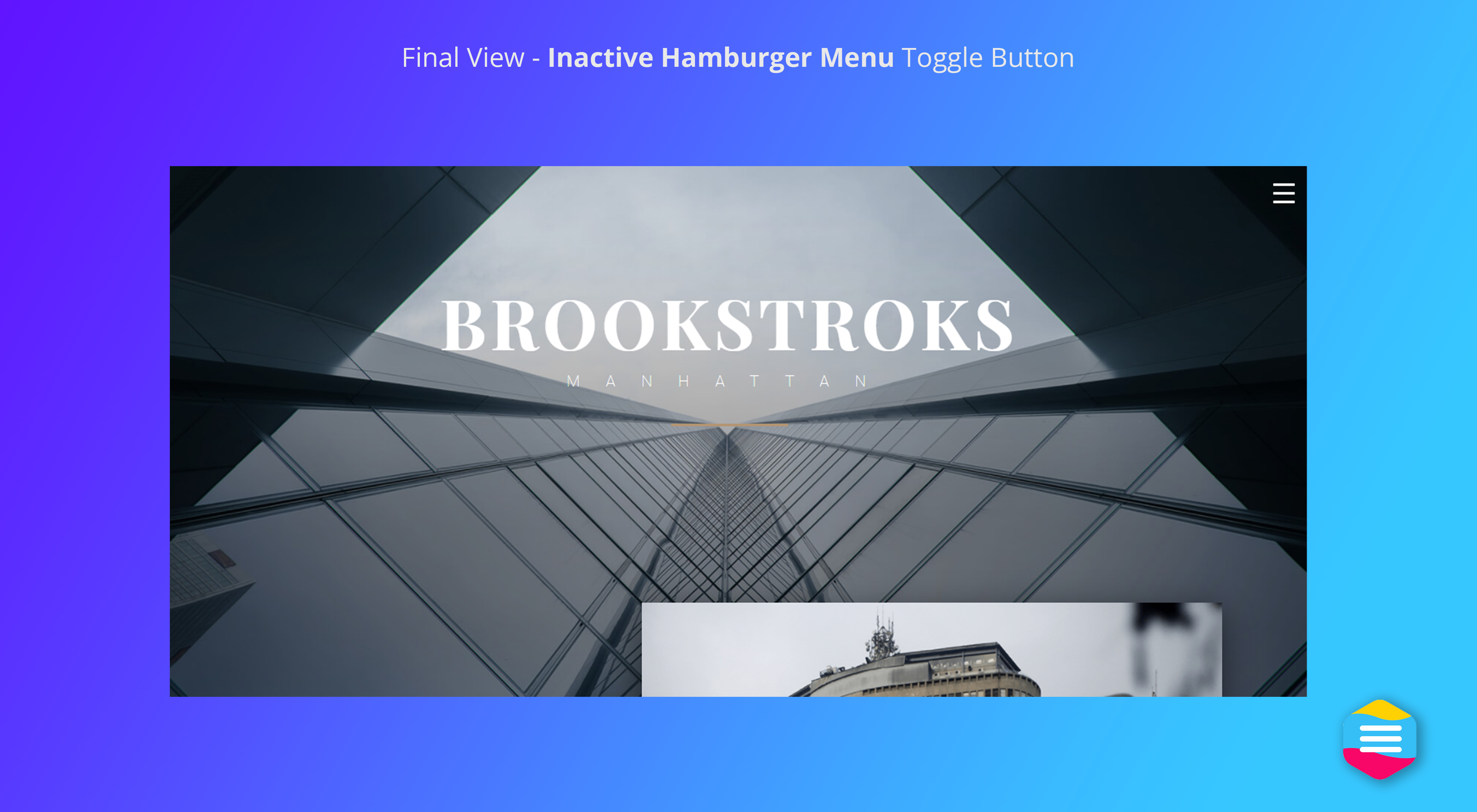
- Mobile hamburger menu. Add a tap-friendly hamburger menu to any theme.
- Off-canvas side menu. Slide the menu in from the left, right, top or bottom, with a slide or push animation.
- Fix a theme menu that breaks on mobile. Replace a theme or page-builder menu that doesn’t work well on phones.
- Sticky mobile header. Keep the menu button fixed as visitors scroll.
- Member-aware menus. Show “My account” to logged-in users and “Log in” to everyone else.
Free features
- Live editor with phone, tablet and desktop preview
- Pre-built menu themes, plus import and export of settings
- Every text, background and border colour, with opacity
- Fonts, font sizes and text alignment
- Menu side (left, right, top or bottom) and slide or push animation
- Button position, fixed or scrolling, with custom icon colours
- Breakpoint: choose the screen width where the mobile menu takes over
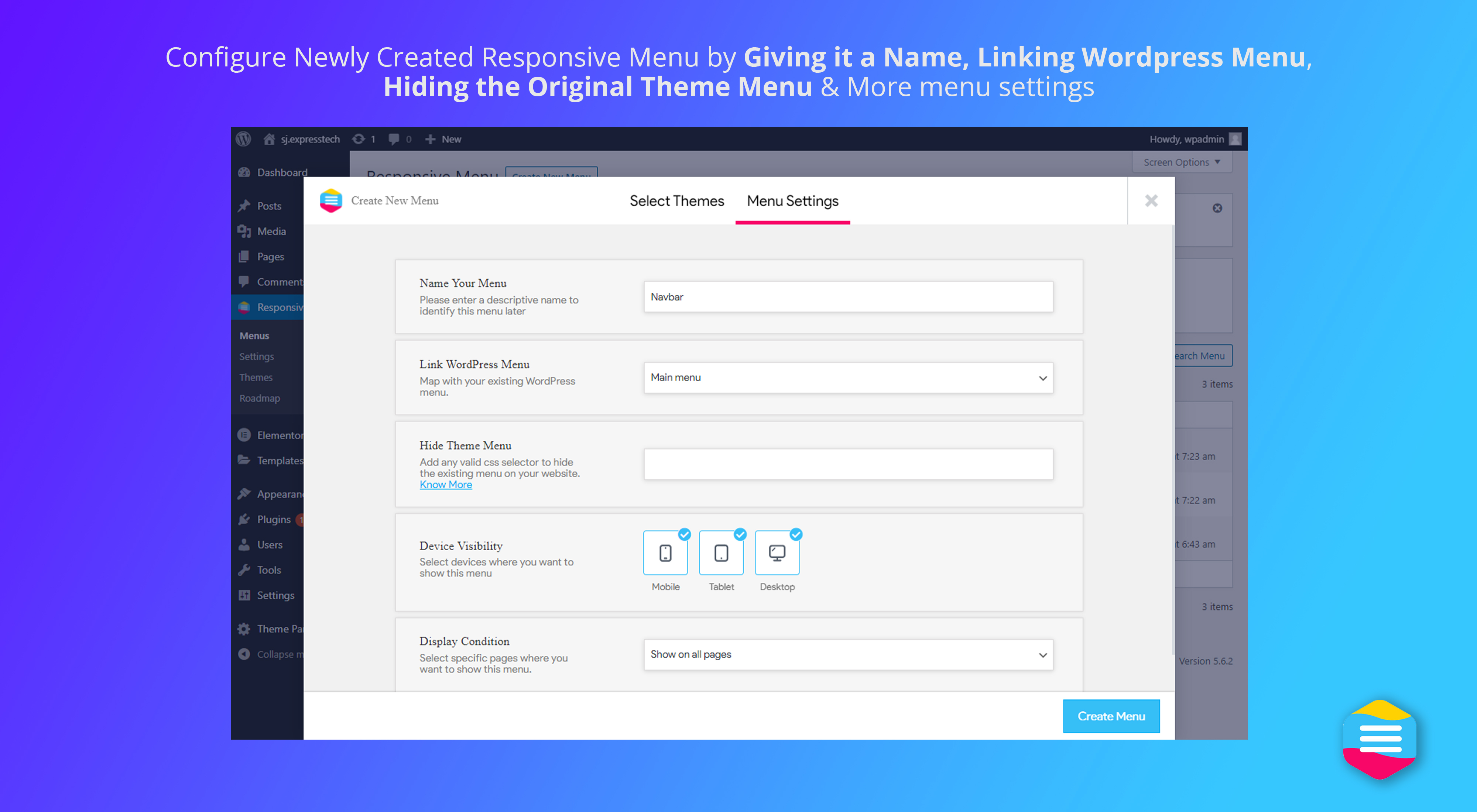
- Hide your theme’s original menu with a CSS selector
- Sub-menu depth, active-item highlighting and custom menu triggers
- Integrated search, logo, title, social and action icons (call, email, links)
- Custom HTML content and custom SVG or icon code on menu items
- Hide items by login state or user role
- Keyboard and screen-reader accessibility (see above)
- Translation-ready
- Option to load scripts minified and in the footer
Responsive Menu Pro
Pro adds desktop navigation and finer control. Every plan includes every Pro feature:
- Desktop & mega menu. Build multi-column dropdowns with links and widgets. On phones the same menu becomes the slide-in menu, so you only maintain one menu.
- Header bar with logo, title, search and custom content.
- 26 animated hamburger buttons, from Spin to Vortex.
- Font icons on any menu item.
- Show on specific pages. Include or exclude the menu page by page and by device.
- WooCommerce menu cart with an item count, opened as a dropdown, drawer or link.
- WPML and Polylang, so the menu follows the visitor’s language.
- Scroll lock to stop the page scrolling behind an open menu.
- Priority support from the team that builds the plugin.
Plans start at $49 a year, with a 14-day refund policy. Your menu keeps working if you stop renewing. Compare Free vs Pro
More from ExpressTech
⏱️ Quiz and Survey Master: create quizzes, surveys and exams in WordPress and turn your site into a lead-generation tool.
⚡ InstaWP: launch a WordPress sandbox site in seconds.
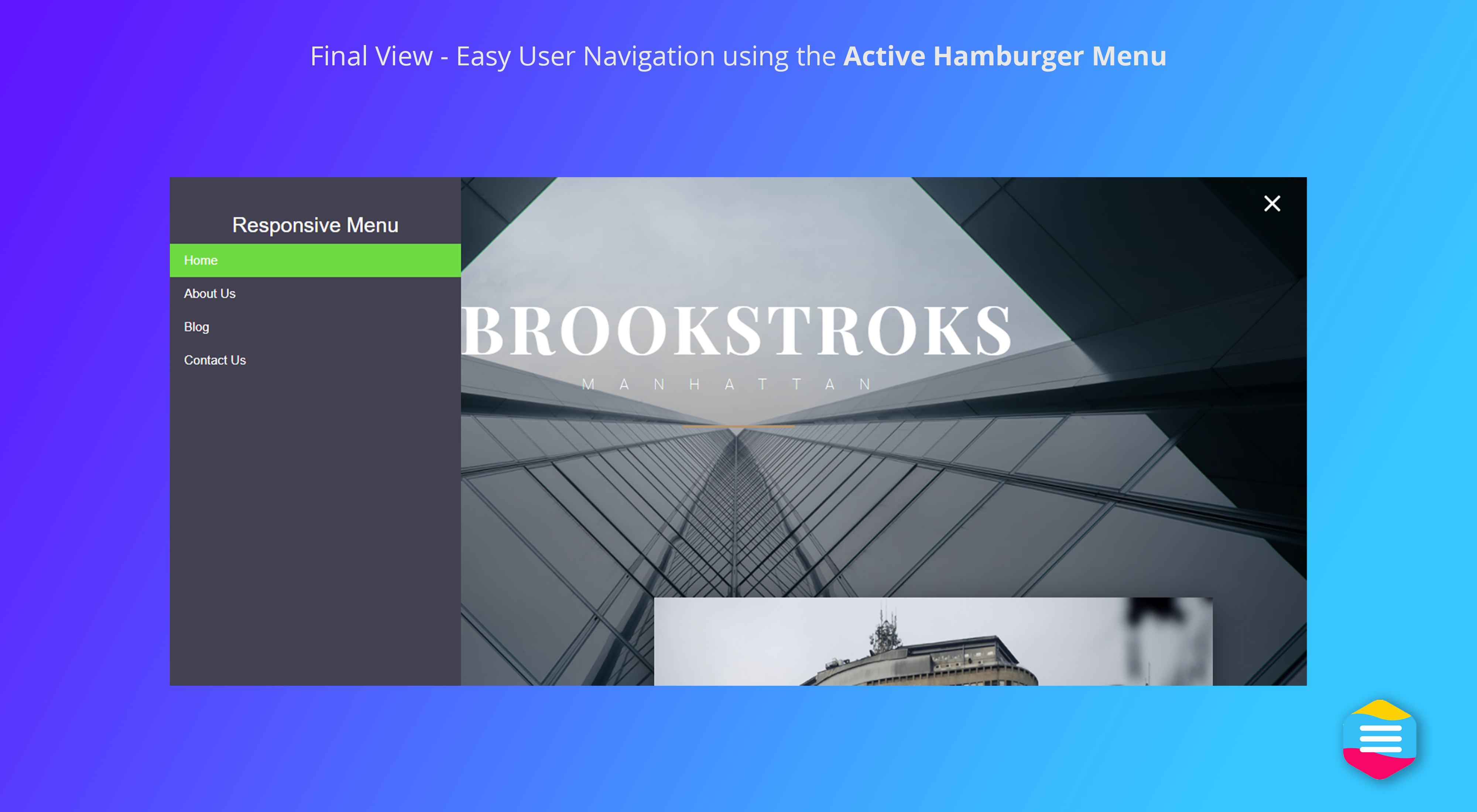
Screenshots


Installation
- In your WordPress admin, go to Plugins Add New and search for “Responsive Menu”.
- Click Install Now, then Activate.
- Open Responsive Menu in the admin menu, pick the WordPress menu to use, and choose a theme or design your own.
- If your theme’s menu still shows on mobile, add its CSS selector under “Hide theme menu”.
Manual install: upload the responsive-menu folder to /wp-content/plugins/ and activate it from the Plugins screen.
FAQ
-
Yes. The free plugin builds a complete mobile and hamburger menu. Responsive Menu Pro adds a desktop and mega menu, a header bar, page-by-page rules and more.
-
Does it work with Elementor, Divi or other page builders?
-
Yes. Responsive Menu doesn’t depend on your theme or page builder. It adds its own mobile menu to the page, and you hide the original menu with a CSS selector. That’s why many people use it when a theme’s or builder’s mobile menu won’t behave.
-
Does it work with block themes and WordPress 7.0?
-
Yes. Responsive Menu is tested with WordPress 7.1.3, and it works on block themes as well as classic themes.
-
The Navigation block only works on block themes and in the Site Editor. Responsive Menu works on any theme or page builder, gives you 150+ design options in a live editor, lets you hide items by login state or user role, and lets you export and reuse your settings on other sites. Pro adds page-by-page rules, a mega menu and a WooCommerce cart.
-
Yes. The menu works with a keyboard: Tab and Shift+Tab move through it, Escape closes it, and focus stays inside the open menu. Buttons and submenus are labelled for screen readers, and the menu respects “reduce motion”. It passes axe-core checks against WCAG 2.0–2.2 A/AA rules. Contrast and tap-target size depend on the colours and sizes you choose. Our accessibility page has the full test results and a checklist.
-
Find the CSS selector of your theme’s menu (for example
.main-navigation) and add it under the “Hide theme menu” option. Our guide to hiding the original menu shows how to find it. -
Yes. Responsive Menu uses the WordPress menu you pick in its own settings, which can be different from your theme’s menu.
-
Yes. The menu can open from the left, right, top or bottom, with a slide or push animation.
-
Does it support translations and multilingual sites?
-
The plugin is translation-ready. Pro adds WPML and Polylang support, so the menu follows the visitor’s language.
-
What happens if I stop renewing Pro?
-
Your menu keeps working. You stop getting updates and priority support.
-
Where can I get support?
-
Free support is on the WordPress.org support forum. Guides are in the knowledge base.
Reviews


Contributors & Developers
“Responsive Menu – Mobile Menu & Hamburger Menu Builder” is open source software. The following people have contributed to this plugin.
Contributors


“Responsive Menu – Mobile Menu & Hamburger Menu Builder” has been translated into 9 locales. Thank you to the translators for their contributions.
Translate “Responsive Menu – Mobile Menu & Hamburger Menu Builder” into your language.
Interested in development?
Browse the code, check out the SVN repository, or subscribe to the development log by RSS.
Changelog
4.7.4 (1st October 2026)
- Feature: Added an option to display menu items only to selected user roles.
- Enhancement: Improved keyboard and screen reader accessibility.
- Bug: Fixed an issue where sub-items of a hidden menu item appeared in its place instead of remaining hidden.
- Bug: Fixed an issue where editing a menu in the Customizer reset per-item visibility settings.
- Bug: Fixed a PHP 8 fatal error that occurred when saving a menu theme.
- Bug: Fixed the live preview showing the wrong element for the title, search and social icons.
- Bug: Fixed admin notices not appearing on Responsive Menu screens.
4.7.3 (20th August 2026)
- Security: Prevented menu theme ZIPs from placing executable files in public uploads
- Enhancement: Added pre-extraction validation and plugin-level permissions for theme uploads
- Enhancement: Resolved PHP 8+ deprecation warnings and theme upload rejection messages
4.7.2 (20th May 2026)
- Patch: Resolved a cross-site scripting (XSS) vulnerability in additional content HTML
4.7.1 (2nd March 2026)
- Bug: Resolved the menu item ordering issue
4.7.0 (12th February 2026)
- Feature: Added support for placing action/social icons inside the menu container (e.g., call, email, facebook, social links)
4.6.0 (23rd July 2025)
- Feature: Added option to hide menu items for logged in and non logged in users
4.5.1 (21st April 2025)
- Bug: Fixed PHP error with SCSS library
4.5.0 (6th November 2024)
- Feature: Enable users to customize the colors of hamburger icons
- Enhancement: Optimize RM editor performance and format JavaScript for better efficiency
4.4.2 (13th August 2024)
- Bug: Resolved parent menu active class issue
4.4.1 (26th July 2024)
- Bug: Fixed compatibility issues with php 8.3
4.4.0 (4th July 2024)
- Feature: Added option to use custom SVG or icon code in menu item
- Enhancement: Improved security and addressed vulnerabilities
4.3.5 (25th April 2024)
- Enhancement: Update scssphp library to 1.12.1
4.3.4 (17th April 2024)
- Enhancement: Added option to minimize script file
4.3.3 (11th March 2024)
- Feature: Added the functionality to navigate menus using the tab key for improved accessibility
4.3.2 (27th Dec 2023)
- Enhancement: Added class to highlight active parent menus
4.3.1 (14th Aug 2023)
- Bug Fix: Addressed the problem related to hamburger line height option
- Enhancement: Anchored tags are now removed if not utilized within the title
Older versions: see changelog.txt.